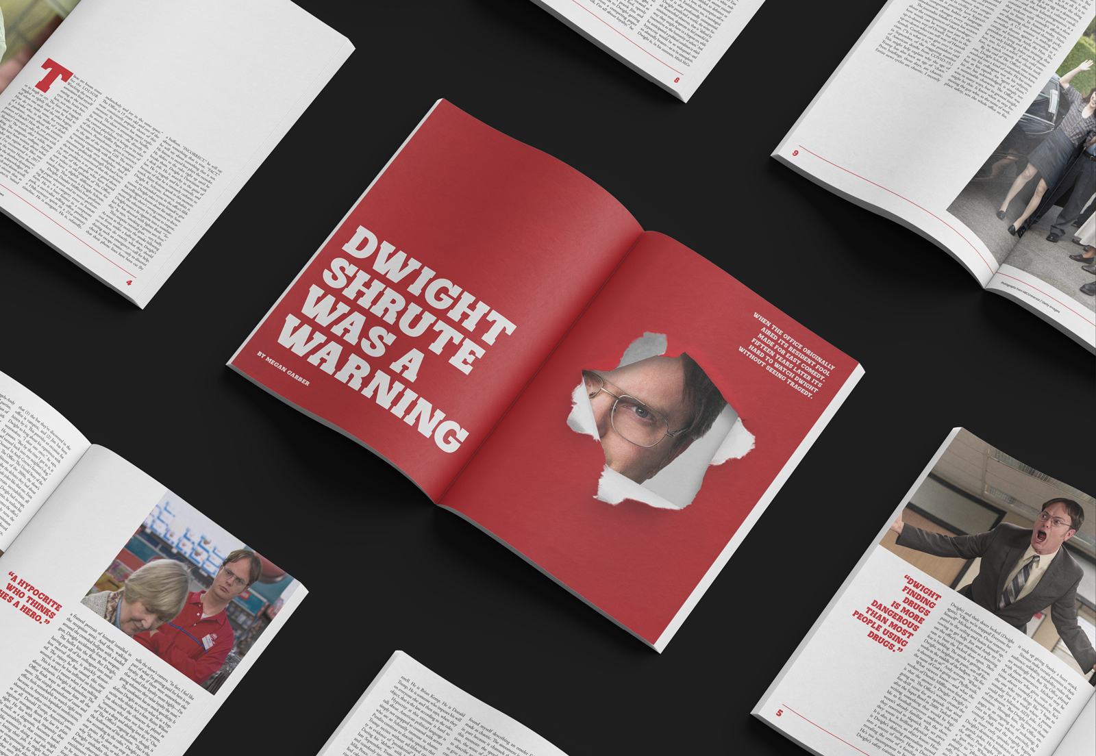
A feature article for a print magazine, titled 'Dwight Shrute Was A Warning.' With the goal of designing an attention-grabbing cover concept that sets the article's tone, an image of Dwight Shrute framed by torn red paper was strategically incorporated to evoke a dramatic effect.
